
VS Code color guide
Dark Purple Theme for VS Code
Explore dark purple themes for VS Code, compare palettes, choose accessible syntax colors, and learn how to install and customize your ideal setup.
What is a dark purple theme?
A dark purple theme uses a low-luminance violet, aubergine, or plum surface as the foundation of the editor and surrounding workbench. It is not simply a dark theme that happens to color the keyword token purple. The tint should be visible in near-black backgrounds, sidebars, tabs, and panels while remaining quiet enough that code stays dominant.
Good examples use several closely related surface values rather than one flat purple field. That depth lets the editor, activity bar, integrated terminal, and popovers read as separate layers without relying on bright borders everywhere.
Why choose dark purple?
In a dim environment, a restrained dark surface can feel less glaring than a bright canvas when display brightness is matched to the room. Purple also gives a workspace more personality and separates it from the neutral gray interfaces around it. Those benefits are aesthetic and situational, not a guarantee of improved eye health.
The tint should support, rather than replace, syntax hierarchy. A successful palette still makes declarations, strings, comments, functions, and control flow distinguishable at a glance; if every token competes in the same violet range, the theme becomes decorative noise.
What makes a great dark purple theme?
- Background depthNear-black violet surfaces should distinguish the editor, sidebar, tabs, and floating UI without turning every boundary into a bright line.
- Primary text contrastDefault text must remain comfortably legible against the editor background; pale gray-violet is often calmer than pure white.
- CommentsComments should be quieter than code but not so faint, thin, or italic that documentation becomes difficult to scan.
- Strings and keywordsStrings and keywords need separate hues or luminance levels so data and control flow remain easy to identify.
- Selection and focusSelections, the active line, matching brackets, and focus rings must stay visible without hiding token colors or selected text.
- Diagnostics and terminalErrors, warnings, information messages, diff colors, and ANSI terminal colors must remain distinct on purple surfaces.
Recommended dark purple themes
These packages are useful examples of different approaches, not a universal ranking. The right choice depends on your languages, display, room lighting, and tolerance for saturated accents.
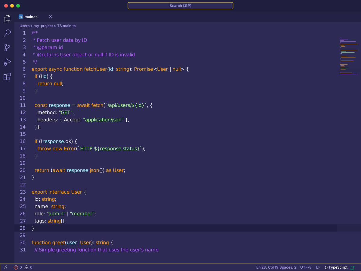
Shades of Purple
By Ahmad Awais ⚡
Shades of Purple pairs a saturated purple workspace with bright, easy-to-distinguish tokens. It is a strong choice when fast syntax scanning matters more than a muted or minimal appearance.
Best for: Developers who prefer vivid syntax and strong visual separation
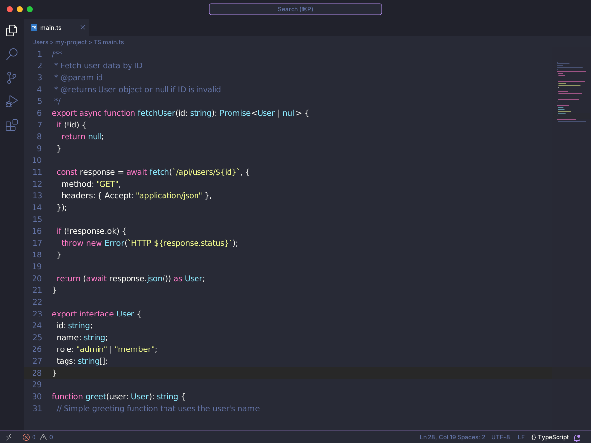
Dracula Theme Official
By Dracula Theme
Dracula combines a dark purple-tinted background with a widely recognized set of cyan, green, orange, pink, and purple accents. Its broad ecosystem helps maintain visual continuity beyond VS Code.
Best for: Developers seeking a familiar palette across multiple tools
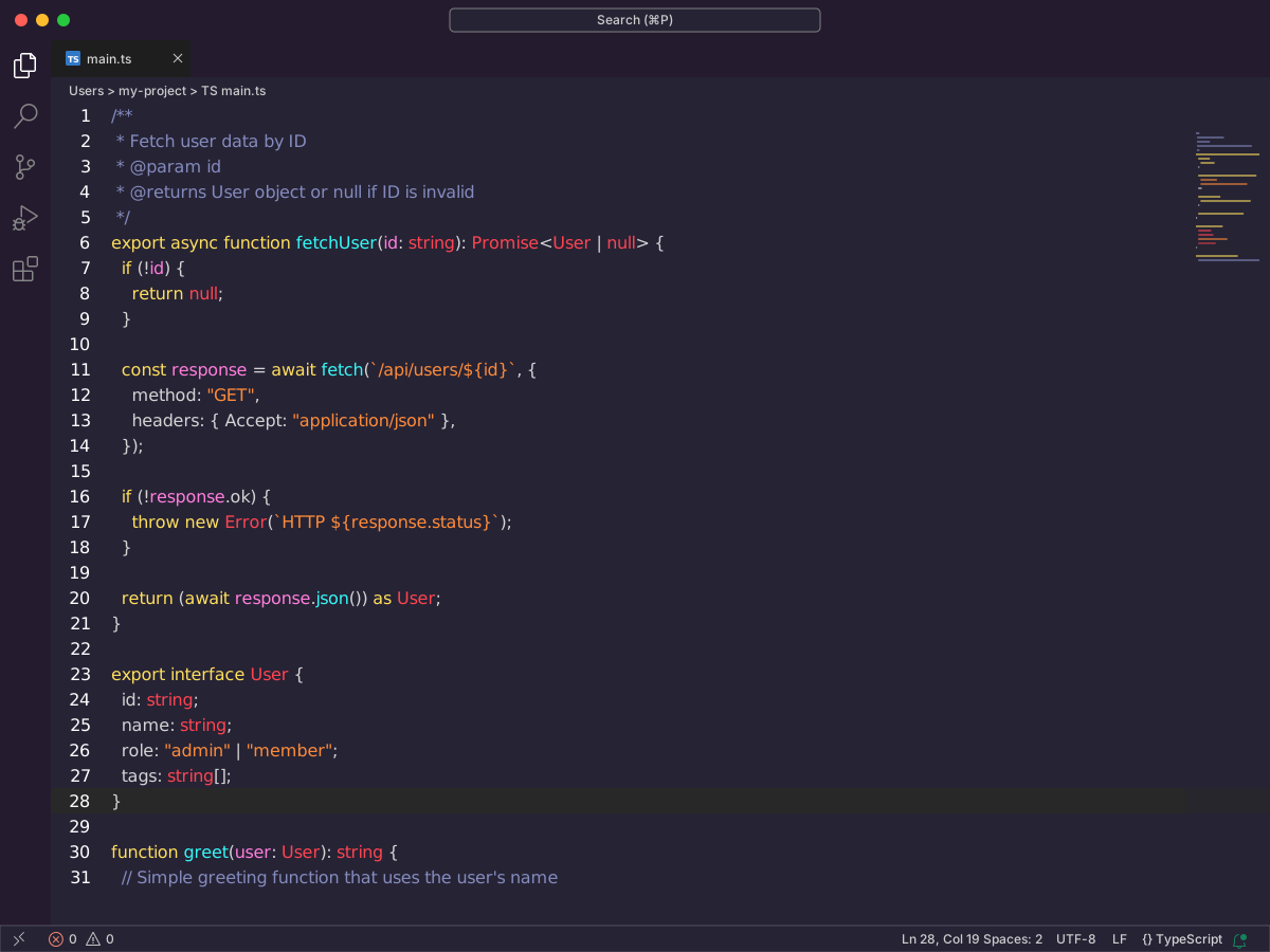
SynthWave '84
By Robb Owen
SynthWave '84 delivers bold magenta and violet accents with an unmistakable retro aesthetic. Optional glow effects are decorative, so verify token clarity and performance before enabling them.
Best for: Developers who want a dramatic neon-inspired workspace
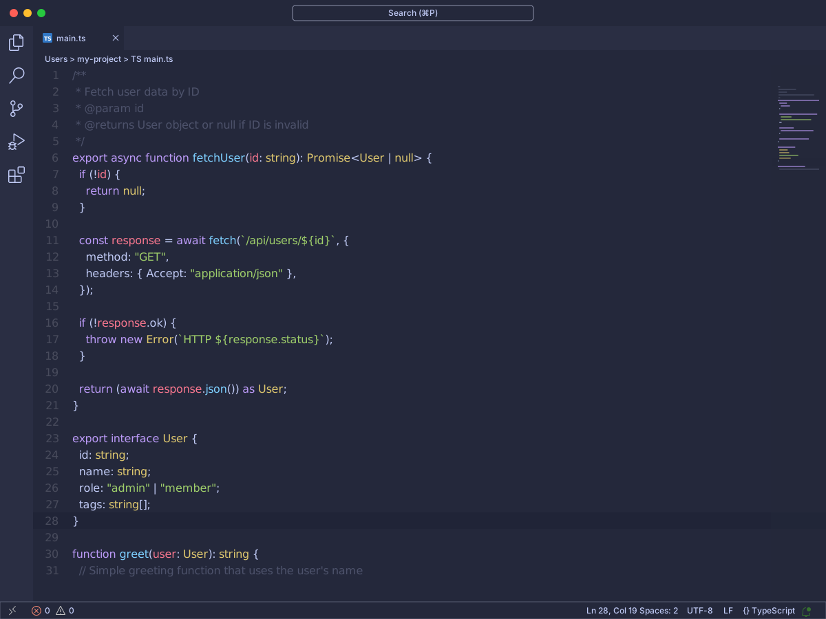
tokyo-night
By Avetis
Tokyo Night uses deep blue-purple surfaces and controlled accent colors to create a polished, lower-key workspace. Its variants make it easier to tune contrast for different rooms and displays.
Best for: Developers who favor cool purples and restrained contrast
How to choose a theme
- Check normal text. Open representative source, tests, Markdown, and configuration files. Read identifiers, punctuation, line numbers, and inactive tabs at your usual font size; the default foreground should be clear without looking stark against the purple background.
- Read comments. Scan a documentation-heavy file and commented-out code. Comments should be quieter than executable code but remain legible when italicized, selected, or viewed on a lower-brightness display.
- Compare strings and keywords. Use a file containing long strings, template literals, imports, and nested control flow. Strings and keywords should be distinguishable from each other and from the background without either color overpowering names and values.
- Test selections and search matches. Select light and dark tokens, place multiple cursors, and search for a repeated term. Active selections, secondary selections, and current and other search matches should remain distinct while the underlying text stays readable.
- Inspect terminal and diff views. Run output that uses several ANSI colors, then open a substantial diff with additions, deletions, and inline changes. Confirm that terminal text, changed lines, diagnostics, and diff highlights remain recognizable on every purple surface.
Installation and customization
Install from Extensions
- Open Extensions with ⇧⌘X on macOS or Ctrl+Shift+X on Windows and Linux.
- Search for the extension name and verify its publisher.
- Select Install and review any extension permissions or notes.
- Open the Command Palette and run Preferences: Color Theme, then choose the installed variant.
Make targeted color overrides
Open your user or workspace settings.json and adjust only the colors that obstruct navigation or syntax recognition. The following is valid JSON; replace values gradually and check selected text, diagnostics, and terminal output after each change.
{
  "workbench.colorCustomizations": {
    "editor.background": "#171425",
    "editor.foreground": "#F2EEFF",
    "editor.selectionBackground": "#7C5CFC66",
    "editorError.foreground": "#FF6B8A",
    "terminal.ansiMagenta": "#B8A7FF"
  },
  "editor.tokenColorCustomizations": {
    "comments": "#8F87A8",
    "strings": "#C6E88D",
    "keywords": "#D9A7FF"
  }
}
Dark purple color palettes
These three starting palettes show how temperature changes the character of a purple workspace. Each sequence moves from the deepest surface through structural and accent colors to the lightest foreground; test the roles in context instead of applying all five colors to syntax.
Balanced violet
A measured violet range with a near-black editor base, clear interface layers, and restrained accents that keep long coding sessions visually organized.
- #171425
- #2A2140
- #7C5CFC
- #B8A7FF
- #F2EEFF
Deep plum
A warmer, low-luminance plum palette that gives panels distinct depth while reserving brighter pink-purple tones for syntax and active controls.
- #160D18
- #30162F
- #6E2D68
- #D47AC7
- #F8EAF6
Cool ultraviolet
A cooler blue-violet palette with crisp separation between surfaces and high-energy ultraviolet accents suited to focused, modern workspaces.
- #101326
- #202654
- #545CF5
- #8EA1FF
- #EDF0FF
Accessibility and visual comfort
Use WCAG contrast ratios as a baseline: aim for at least 4.5:1 for normal text and 3:1 for large text, then test the actual editor because syntax colors, anti-aliasing, and font rendering affect perception. Low contrast comments are still a problem even when the main foreground passes.
Match display brightness to indoor light, avoid very thin font weights, and verify meaning without relying on hue alone. Color-vision differences can make purple, blue, pink, and red states converge, so diagnostics and selections also need clear luminance, decoration, or shape cues.
During sustained screen work, the 20-20-20 practice is a simple reminder: roughly every 20 minutes, look at something about 20 feet away for 20 seconds. It is a break habit, not a medical promise, and a theme does not prevent or treat eye strain. Adjust text size, posture, room light, and breaks to your own needs.
Frequently asked questions
Is a dark purple theme suitable for everyday coding?
Yes, when its contrast and syntax hierarchy match your environment. Evaluate comments, selections, diagnostics, and inactive panels in the languages you use instead of judging only a promotional screenshot.
What is the best dark purple theme for VS Code?
There is no universal best option. Shades of Purple favors vivid contrast, Dracula offers a familiar balanced palette, SynthWave '84 is highly expressive, and Tokyo Night provides a cooler, calmer interpretation.
How do I install a dark purple theme in VS Code?
Open Extensions with Command-Shift-X on macOS or Control-Shift-X on Windows and Linux, search for the package name, select Install, then use Preferences: Color Theme from the Command Palette.
How can I customize a dark purple theme after installation?
Add targeted workbench.colorCustomizations and editor.tokenColorCustomizations entries to settings.json. Override only colors that impede navigation or syntax recognition so future theme updates remain useful.
Do dark themes improve eye comfort during long sessions?
A dark interface may feel comfortable in a dim room, but comfort depends on ambient light, display brightness, contrast, text size, and individual preference. A color theme is not a medical intervention and offers no guaranteed health benefit. Take regular breaks and adjust the workspace to suit your environment.