Maccarone For VSCode
Publisher: PeterThemes in package: 1
a vscode theme plugin
a vscode theme plugin
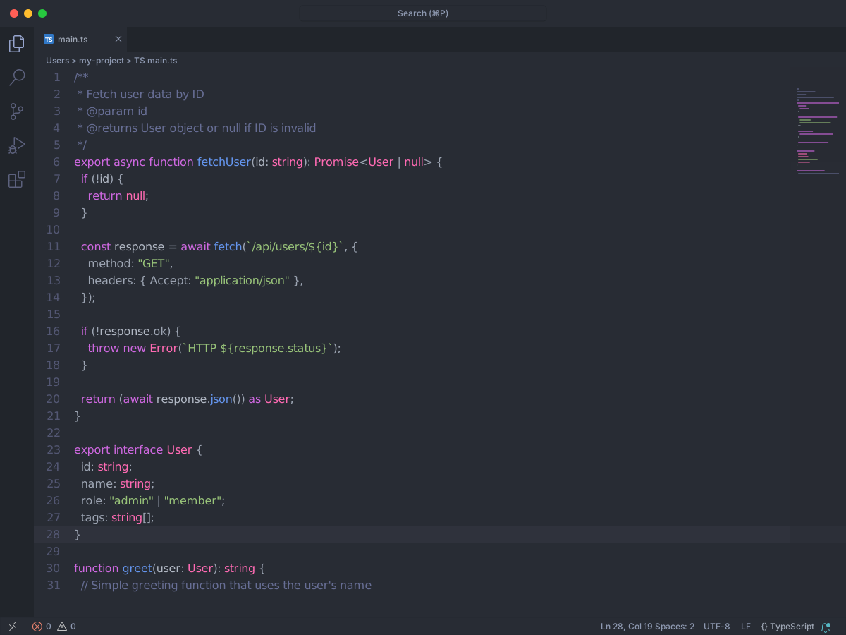
Full workbench mockup using this variant's colors and tokenColors.
Loading...
Workbench UI color keys from the theme JSON colors map.
| key | HEX | RGB | RGBA |
|---|---|---|---|
badge.background | RED | — | — |
badge.foreground | |||
button.background | |||
button.border | |||
button.foreground | |||
button.hoverBackground | |||
button.secondaryBackground | |||
button.secondaryForeground | |||
button.secondaryHoverBackground | |||
button.separator | |||
checkbox.background | |||
checkbox.border | |||
checkbox.disabled.background | |||
checkbox.disabled.foreground | |||
checkbox.foreground | |||
checkbox.selectBackground | |||
checkbox.selectBorder | |||
descriptionForeground | |||
disabledForeground | |||
dropdown.background | |||
dropdown.border | |||
dropdown.foreground | |||
dropdown.listBackground | |||
editor.background | |||
editorActionList.background | |||
editorActionList.focusBackground | |||
editorActionList.focusForeground | |||
editorActionList.foreground | |||
errorForeground | |||
focusBorder | |||
foreground | |||
icon.foreground | |||
input.background | |||
input.border | |||
input.foreground | |||
input.placeholderForeground | |||
inputOption.activeBackground | |||
inputOption.activeBorder | |||
inputOption.activeForeground | |||
inputOption.hoverBackground | |||
inputValidation.errorBackground | |||
inputValidation.errorBorder | |||
inputValidation.errorForeground | |||
inputValidation.infoBackground | |||
inputValidation.infoBorder | |||
inputValidation.infoForeground | |||
inputValidation.warningBackground | YELLOW | — | — |
inputValidation.warningBorder | YELLOW | — | — |
inputValidation.warningForeground | YELLOW | — | — |
list.activeSelectionBackground | |||
list.activeSelectionForeground | |||
list.activeSelectionIconForeground | |||
list.dropBackground | |||
list.hoverBackground | #353 94B | — | — |
progressBar.background | |||
radio.activeBackground | |||
radio.activeBorder | |||
radio.activeForeground | |||
radio.inactiveBackground | |||
radio.inactiveBorder | |||
radio.inactiveForeground | |||
radio.inactiveHoverBackground | |||
sash.hoverBorder | |||
scrollbar.background | |||
scrollbar.shadow | |||
scrollbarSlider.activeBackground | |||
scrollbarSlider.background | |||
scrollbarSlider.hoverBackground | |||
selection.background | |||
sideBar.background | |||
tab.unfocusedActiveBackground | |||
textBlockQuote.background | |||
textBlockQuote.border | |||
textCodeBlock.background | |||
textLink.activeForeground | |||
textLink.foreground | |||
textPreformat.background | |||
textPreformat.foreground | |||
textSeparator.foreground | |||
toolbar.activeBackground | |||
toolbar.hoverBackground | |||
toolbar.hoverOutline | |||
widget.border | |||
widget.shadow | |||
window.activeBorder | |||
window.inactiveBorder |
Foregrounds this theme assigns to the token scope catalog. A rule with only a font style is skipped, and a longer matching scope wins. Italic and bold rules are not listed — the preview above shows them in the code.
This theme does not set foregrounds for these scopes.
export interface User {
  id: string;
  name: string;
  role: "admin" | "member";
  tags: string[];
}

/**
 * Fetch user data by ID
 * @param id
 * @returns User object or null if ID is invalid
 */
export async function fetchUser(id: string): Promise<User | null> {
  if (!id) {
    return null;
  }

  const response = await fetch(`/api/users/${id}`, {
    method: "GET",
    headers: { Accept: "application/json" },
  });

  if (!response.ok) {
    throw new Error(`HTTP ${response.status}`);
  }

  return (await response.json()) as User;
}

function greet(user: User): string {
  // Simple greeting function that uses the user's name
  return `Hello, ${user.name}!`;
}