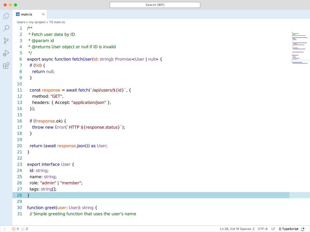
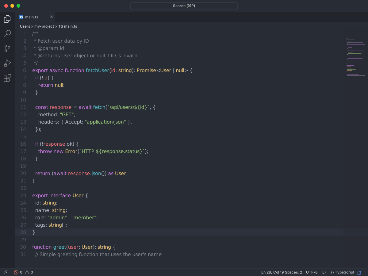
This theme has a dark black glossy background with texts only in shades of white/silver/gray. A true dark theme for the feeling of a monochromatic world of whites on black. It might not be everyone's cup of tea, which is completely fine ;)
Full workbench mockup using this variant's colors and tokenColors.
fetchUser.ts
index.ts
README.md
src
components
fetchUser.ts
User
tags
1
2
3
4
5
6
7
8
9
10
11
12
13
14
15
16
17
18
19
20
21
22
23
24
25
26
27
28
29
30
31
32
33
34
export interface User { id: string; name: string; role: "admin" | "member"; tags: string[];}/** * Fetch user data by ID * @param id * @returns User object or null if ID is invalid */export async function fetchUser(id: string): Promise<User | null> { if (!id) { return null; } const response = await fetch(`/api/users/${id}`, { method: "GET", headers: { Accept: "application/json" }, }); if (!response.ok) { throw new Error(`HTTP ${response.status}`); } return (await response.json()) as User;}function greet(user: User): string { // Simple greeting function that uses the user's name return `Hello, ${user.name}!`;}
Problems1
Output
Debug Console
Terminal
Ports
~/my-project $ pnpm test
✓ fetchUser passed 12blk
✗Cannot find name 'user'. error
▲warning 412 readylocalhost
http://localhost:3000
WSL
1 1
main*
Copilot
Ln 5, Col 12
Spaces: 2
UTF-8
LF
TypeScript
True Black Dark Theme
colors
Workbench UI color keys from the theme JSON colors map.
key
HEX
RGB
RGBA
activityBarBadge.background
editor.background
editor.findMatchBackground
editor.findMatchForeground
editor.findMatchHighlightBackground
editor.findMatchHighlightForeground
editor.foreground
editor.selectionBackground
editor.selectionForeground
editor.selectionHighlightBackground
editorBracketHighlight.foreground1
editorBracketHighlight.foreground2
editorBracketHighlight.foreground3
editorBracketHighlight.foreground4
editorBracketHighlight.foreground5
editorBracketHighlight.foreground6
editorPane.background
sideBar.background
sideBar.border
sideBar.dropBackground
sideBar.foreground
sideBarTitle.foreground
statusBar.background
statusBar.border
statusBar.foreground
statusBarItem.activeBackground
statusBarItem.hoverBackground
statusBarItem.hoverForeground
tokenColors
Foregrounds this theme assigns to the token scope catalog. A rule with only a font style is skipped, and a longer matching scope wins. Italic and bold rules are not listed — the preview above shows them in the code.